Implementing AI Categorization for DataFeedWatch web app
2024
I was given this project with a simple vision: “If we implement AI features before our competition, we’ll have a unique edge over them.”
I was briefed on figuring out how to fit 3 new features into our current product. But like always, it turned out that design is needed for more than just mapping the flows and creating visuals. In this case study, I’ll show you how I designed one of these 3 features.
Generating product names and descriptions
AI Product Categorization
Filling missing product sizes and colors
There were 2 certain things with this project
1. The company believes that AI will solve our users' problems but doesn't have any proof of that.
2. If I don’t act fast, we’ll implement something having no idea about use cases or product value for the users.
So my main question was:
What are the goals and needs of somebody, that categorizes their products?
But how do I start if I don't
know anything else?
I started with 2 quick workshops in small groups
A quick ideation session with developers
This may seem weird. Why is ideation so early? Why with developers exactly? My goals were to:
Understand the basics of how the feature could work technically
Make devs feel like they’re a part of the process (Their input was crucial later on in the process)
Get info about technical constraints as soon as possible
Collect honest opinions on the project and ideas from a different perspective
Planning session with a PM and UX Researcher
We had a lot of questions. Who would use this new feature? What are their goals?
Create a plan that can be presented as our timeline
Define the questions that the UX Researcher will try to answer through interviews
Build a design process that will allow all of the stakeholders to stay in the loop
I knew I had to create the first iteration of the feature quickly
In a perfect world I’d get all of the research first, go through ideation and only then to design. I had important reasons for taking a different approach though.,,

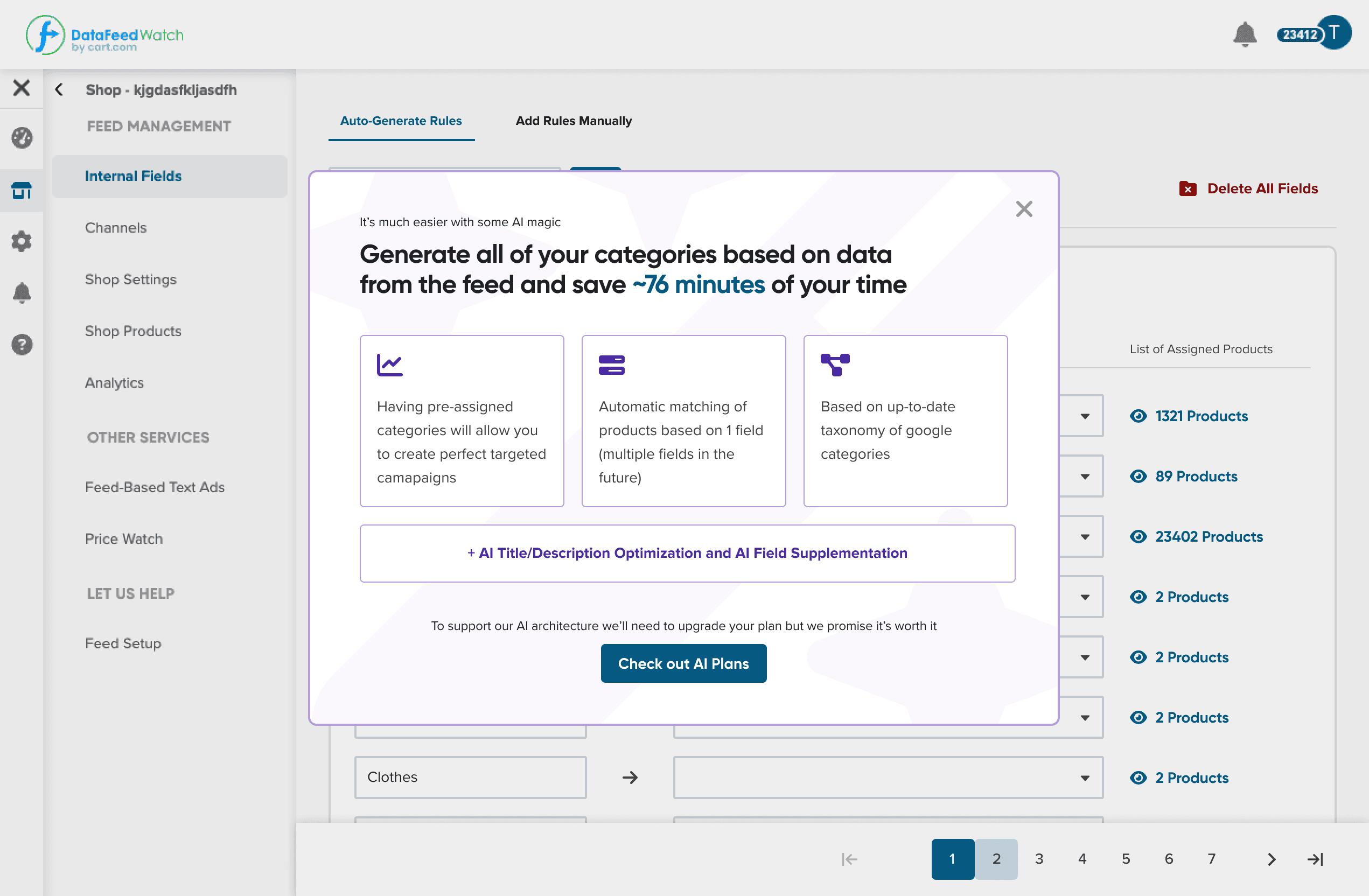
The first iterations were extremely clunky due to the management pushing for selling the additional AI plan in-app.
I needed to verify that my vision for the feature matched the vision that our CEO tried to convey at the beginning (the CEO didn’t like that my version was more complex)
I needed to check if my vision for this feature was doable technically in our timeframe (it wasn’t)
I needed to check if my solutions were usable for the type of work that our clients do. (I didn’t take into account how many categories they need to assign at once.)
AHA!
Collecting data from 10 user interviews, and meetings with people from the sales team allowed me to present the list of user’s goals and potential issues we need to face.
1
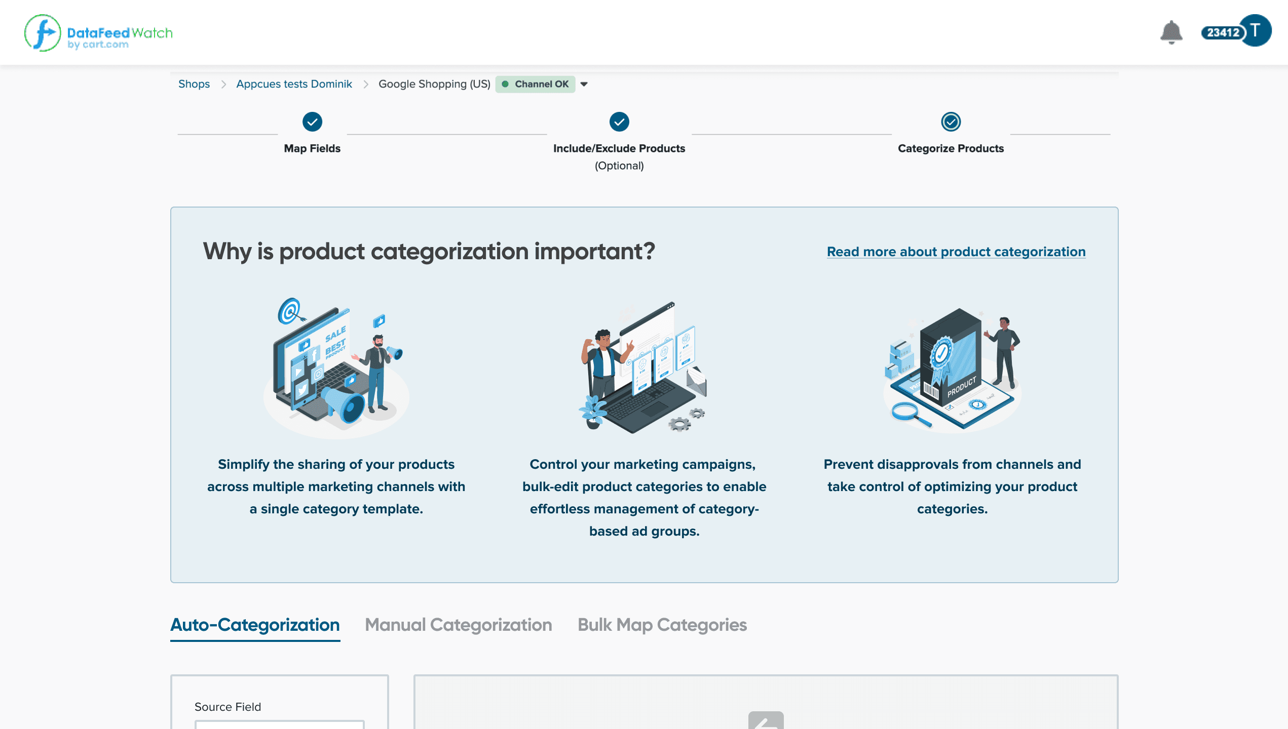
Many users don’t understand the impact of product categorization.
If they don’t categorize their products, they won’t need and appreciate AI. Why don’t we help them optimize their work?
2
Users don’t trust AI to handle all of their data without validating the outcome.
This discovery allowed me to sway management into investing in a feature that previews AI content before the user sends it out.
3
There are so many different use cases of AI-Categorization that we won’t be able to cover them for a long time.
This was a bucket of cold water for the management believing AI is a magical solution for everything. It helped them to transform the model for this feature from paid to free.
4
AI-Categorization is an onboarding optimization project, not a feature.
This was the biggest discovery. It changed how I looked at the project from trying to build a feature, to creating a better onboarding for the user using AI.
With collected data, I showed the user onboarding journey I prepared highlighting all of their frustrations. The highlight was a video of a user trying to use our old categories.
With evidence, management finally agreed that this screen needs radical improvement and was willing to invest more time into it.

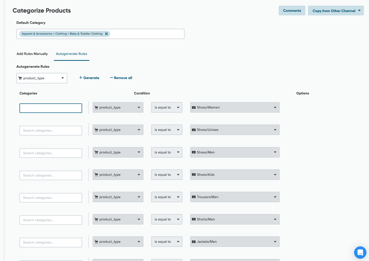
This is how our categorization looked like before the changes. Before you understand how to assign a category, you’d already get frustrated. How is the user supposed to feel like they are using cutting-edge technology with a UI that looks like that?
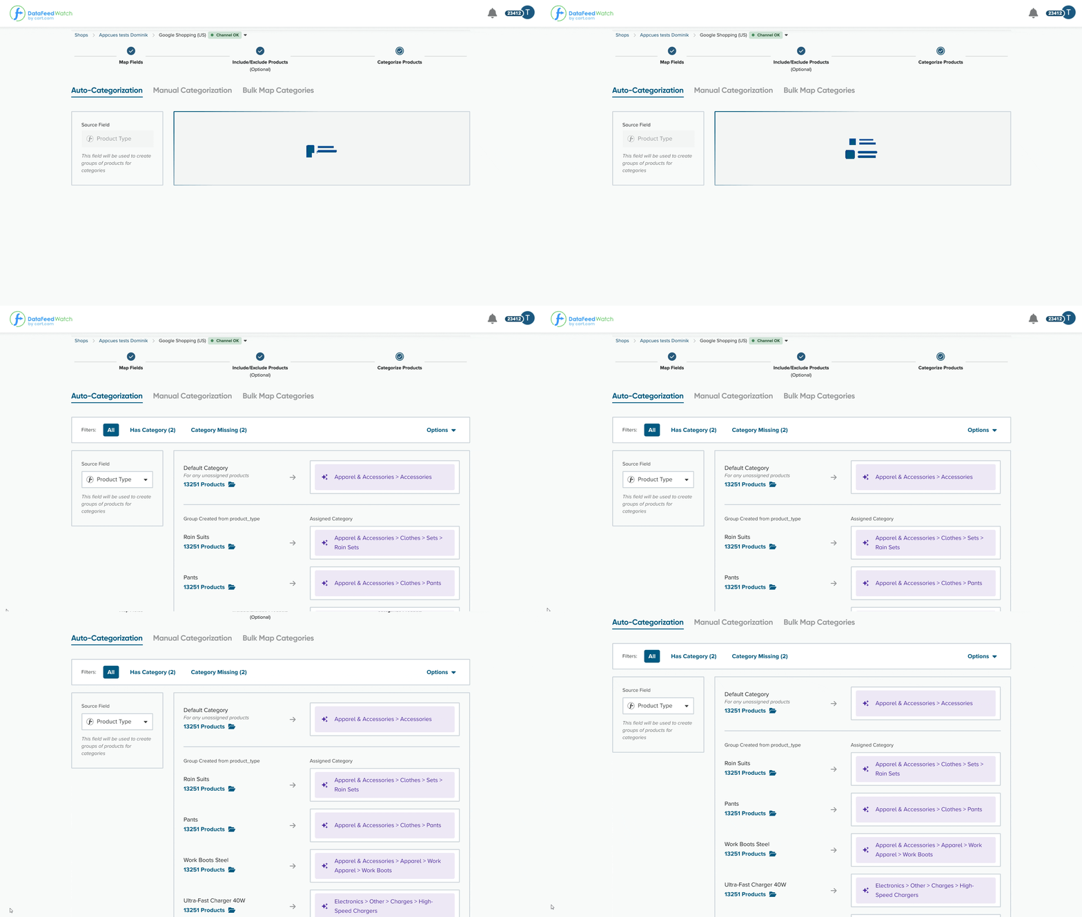
After a few iterations, I was able to create a design that addressed my concerns.
What I'm proud of:


